Showing posts with label kitchen. Show all posts

Monday, August 2, 2010

wired.

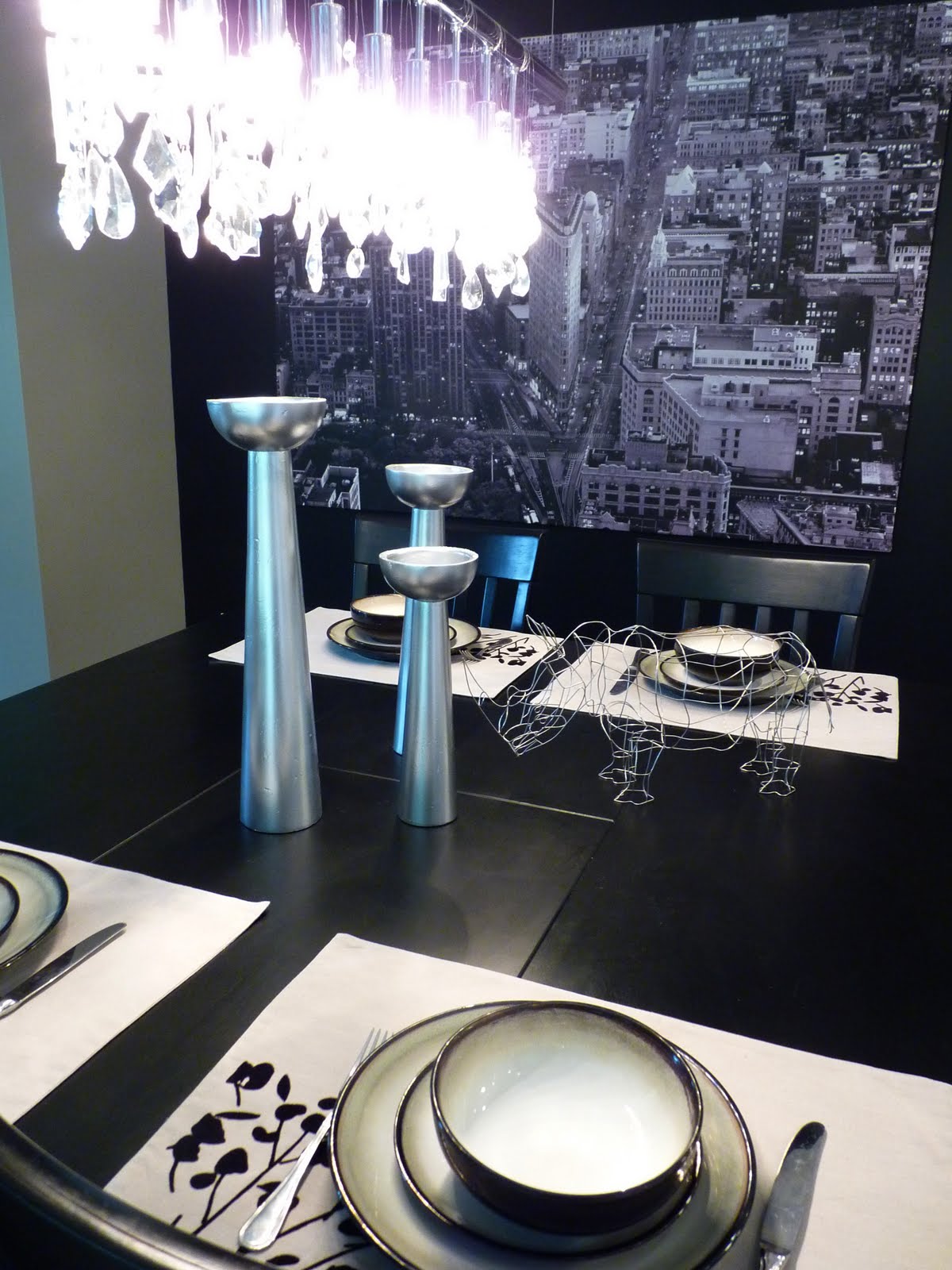
while soaking in one of michigan's sleepy summer beach towns a couple months ago, i encountered this wiry sculpture.


after one sighting it was deposited in my memory bank....until just the right time for a withdrawal. i particularly appreciated the simple form + perfectly proportionate amount of quirk.


this july we were wandering back through the shop and my husband made the unfortunate disclaimer that i could have the air apparent rhino....only if he were made by hand.

he was.

and therefore our household gained a pet that day.  just the kind of pet i like, too.  no maintenance.  easy on the eyes.  an utter lack of mysterious smells.


for now he's positioned at our kitchen table + with the big new york print on the black wall, it feels a little like night at the museum in the middle of our house.  with free admission.

like lucite or acrylic objets, it simultaneously adds to the space while visually taking up no room at all. which works out well considering our kitchen table is in the middle of three rooms, so too many heavy decorative items would really break things up.

Wednesday, June 30, 2010

dolla dolla bills y'all

as of late i have become a little bit obsessed with finding dollar store decor deals.

why?

+ no one else usually has it, and i love having unique things

+ there's no pressure for it to be perfect or last forever

+ each item is $2 [ok, just making sure you're paying attention]

+ each item is $1 [for reals]


each of the things i've come upon recently is a kitchen item, or at least i am using the item that way so far.

exhibit a: a few contributors to my current red-green show in the kitchen.

stripey on the left....


citrus punch on the right....


....and vegetable soup, to warm things up with a little humor. [yes, you can stop squinting, the towel indeed says 'veg soup'. just to clarify what that hot bowl of mystery is.]

i love the outline drawings on this particular towel. so quirky-modern to my eye.


exhibit b: a cheapo yet vintagey looking powdered sugar shaker. ribbed for extra pleasure.


exhibit c: a set of twelve votive holders reincarnated as parfait cups

i fell for their modern lines + how they mimic stemless wine glasses [which i plan to try using them as at some point, too]


here they are on duty at a baby shower i co-hosted this weekend:


i plan to try them as vases next. i'm thinking 5 in a line on the mantle with perhaps a single leaf per vase.


so if you add it all up that's $17 [i have two of the lime green towels] but oh so much more satisfaction.

Thursday, June 24, 2010

a modern love affair

in a cheeky nod to alexander girard's midcentury textile design, i purchased this heart throb at marshalls a while back. $7.99. ohhh yeahhhhh.

i love how the E is fork-like, as if trying to take a stab outta that there faux fruit. this is all the more noticeable with the plaque placed on its side, rather than hanging it up vertically. i think positioning it upright would have emphasized the heart shape, which i was less interested in than the quirky bold text.

normally, i'm not a red person. you may have noticed this by the absence of any, well, RED in my home to date. [spoiler alert: this is not a rocket science blog] however the moment i saw this thin wood plaque i instantly recognized it as a cheap knockoff of girard's work, which happens to sell on a pillow at urban outfitters for $40 [vs. the $8 i shelled out], and therefore knew this knockoff belonged with ME.

and now, i have to say i'm really enjoying the mix of red + lime green accents in our predominantly white + grey kitchen.

here's a view of what she looked like last fall, before i started injecting a l'il more color into her life.


something about the combination of red with citrusy lime green has just the right visual relationship....something my mom knows all about, since she patterned much of my parents' cottage around this idea. what cay i say....the apple doesn't fall so far from the tree after all! [oh come now. you knew an apple reference was coming after discussing red + green like that!]

tenyenhuis cottage....r.i.p.
may your new owners enjoy you immensely.

Monday, August 3, 2009

counter offer.

so we had a plan for our kitchen from the get-go: we wanted to go a different direction from our last kitchen's dark cabs, and instead go light, bright + more modern. with an industrial edge. kinda like so, as seen on HGTV's site.

or like so. love the fresh + crisp feeling this image from Apartment Therapy evokes:

all along we'd been planning on white painted cabinets, in combination with the dark asian walnut hardwood we'd fallen for. as for the countertop material we really wanted something sleek + minimalist....i love quartz for this look, as you get the cool, shiny surface of stone but without all the veins or distractions of granite. [you also get built-in stain and bacteria protection. bonus!]

here was my #1 pick:
silestone's unsui - part of the zen collection. i loved that while it was a clean, totally plain look, it wasn't too cold looking. i'd also seen this used in one of candice olsen's designs and thought it looked so smooth and chic!

however, as we rounded the corner on the very LAST phase of building this spring, we were kindly informed that we could NOT in fact get this option after all [yes, we had asked all manner of questions along the way to try and avoid this situation]....the slab size apparently would not fit our island shape + size. this was wonderful news to receive, the day the paint had gone up on the walls further cementing the color scheme....which was based on the unsui tops! ugh.

so we received the shortlist of available options that would fit our island [i wasn't too keen on visually breaking up the look of the tops between island + outer area]. most of them looked like this:

or this:
ummmm, no thank you. so i was thrilled beyond belief when THIS color was on the list, in all its pseudo-polished-concrete glory!!!

i was a tiny bit hesitant because of the possible 'cold' look mentioned earlier. but funny enough, i had a sample at home since it had been on the early debate list - and looking at the 4"x4" square, i realized it was meant to be! ....a happy accident.

since kevin and i simply must research things before acting, we did make we sure had some online assurance of this stone's overall appeal. thanks to a couple of galleries we stumbled across, like jenschulze's on flickr, we could uncross our fingers and take the leap.

a little dust wasn't going to deter us! we knew this color would be just right. [we did also take the sample square to the house, since often the color of paint, carpet + other materials will change in different lighting and every room seems to get its own strength of natural light]

aaaand here it is, in the new house!
it may be hard to see, but we requested the very SQUARE-est edge that they could possibly cut, barring anything that would injure us or our future offspring, of course. usually when you go for clean or modern looks the items are inexplicably at the top of the price scale....thankfully with quartz + granite, squared off edges are the least expensive choice. yippee!

and an action shot....i was going for that super slick Dwell magazine look. my mom makes a greal model, doesn't she?


banana-zucchini bread + one very high maintenance ikea towel


and to round out the rest of the kitchen....can't live without these!

hey everybody, come see how good i look!


so what do you think? did we achieve the modern-industrial kitchen aesthetic i had hoped for?
as far as the grey countertop, i think it's right at home.

Monday, July 27, 2009

battle of versailles

about a year + a half ago, i came across this light fixture called the versailles chandelier on motiffurniture.com. i was actually helping my girlfriend look for light fixtures for her own house project, and while shopping the site the versailles just jumped off at the screen at me! i could not shake it out of my head and i swore it'd be hanging in my next house, someday.

lo + behold, we did end up building again just a year later and here it is....

AHHHH! i still love it just as much every time i look at it. i think it just screams modern glam attitude and yes indeedy, this became the muse for the canvas of our house.

one of the things i love is that visually it is light as air. we have an open floor plan from the kitchen through to the living room, and really throughout the whole first floor. so i loved the idea that while this chandelier is completely eye-catching with its crystals at the same time it simply floats on wires and barely takes up any room. [in fact, the wires are nearly invisible in the pictures below!]


and yes, whenever you move into a new home, whether its newly built or new-to-you, one of the most fun things has to be running around the house like a kid flicking every light switch a bazillion times....and don't get me started on testing out the dimmers! yep, this lady likes to steal the show after dark.


oh! and i almost forgot. it just happens to be a much more affordable version of this chandy.