Showing posts with label decor details. Show all posts

Monday, August 30, 2010

clear as day

a photo a day....keeps the a.d.d. decorator at bay?

so maybe i'm not switching out mantle-top photos every day of the week, but i like having the setup for it.   i decided on a whim to print some extra [read: non-baby] photos last week while ordering up a good 80 prints or so of the little man. and yes i got the prints for free and yes i am dutch. since its nearly impossible for me to keep things in the same place for long, decor-wise, i thought it'd be convenient to have a frame available that would go with anything + would display atmospheric photos well, to correspond with whatever else is happening in the room at the time.


right now, this 5x7 acrylic frame sits on our fireplace mantle but it could just as easily migrate to another alcove of our abode.  but i'm enjoying the mantle location since the mood in our living room has mucho possibility for change....being that most elements of the room are a neutral foil for a variety of accessories.


i currently have mainly citrusy yellow + green tones flavoring our surroundings.  so first i went for a pop of sky blue....literally....with a photo i snapped this spring. for some crisp + clouded contrast.


after a week or so i decided to go with the shot shown above, that coincided with the existing accent colors.  this pup is a print that hails from a winter trip to domican republic. just what the d.r. ordered, eh?  ehhh?  [har..har....har] i was smitten with this street-side stand spilling over with golden greens + yellows.


future candidates for office include....

strawberry kisses [for a touch of warmth + texture]


wheels [are for whimsy]


cheerful chairs [that tell a story]


....and many more.  the options are endless, really!  and if there's a certain color or pattern i'd like injected into the space i can always seek it out, snap it + print it.  i like the personal story behind each photo as well, that briefly transports me back to the day + place i photographed that particular moment.

clearly, this frame looks to be $12 well spent [finally that 20% off coupon came in handy!].

Tuesday, August 3, 2010

chevy chase

who knew shopping for wipes could be this fun.


during a routine diaper + wipe run this morning i had the pleasure of discovering this cheeky chevron'd queen.


and while i debated finding an excuse to keep the container on our main floor for viewing pleasure, it did eventually make it upstairs to the nursery.  i can't promise it'll stay there though!


 let's hear it for huggies!

Monday, August 2, 2010

wired.

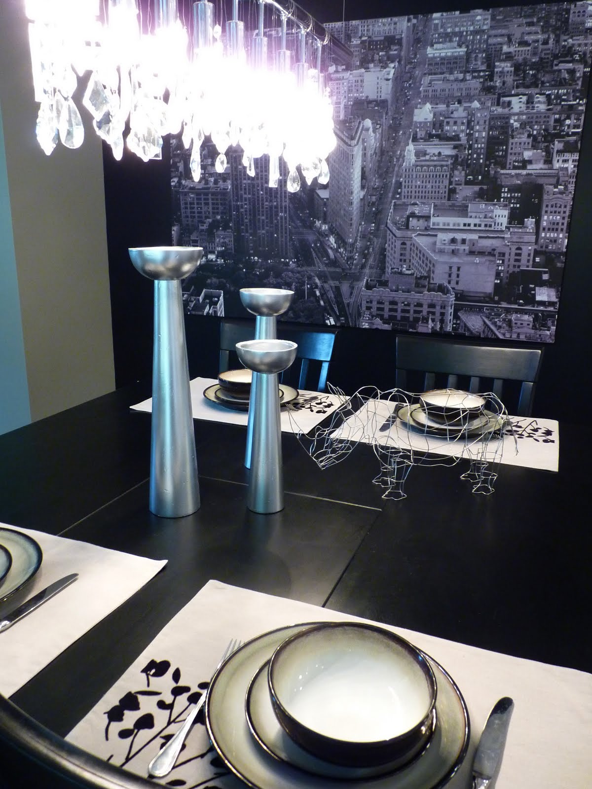
while soaking in one of michigan's sleepy summer beach towns a couple months ago, i encountered this wiry sculpture.


after one sighting it was deposited in my memory bank....until just the right time for a withdrawal. i particularly appreciated the simple form + perfectly proportionate amount of quirk.


this july we were wandering back through the shop and my husband made the unfortunate disclaimer that i could have the air apparent rhino....only if he were made by hand.

he was.

and therefore our household gained a pet that day.  just the kind of pet i like, too.  no maintenance.  easy on the eyes.  an utter lack of mysterious smells.


for now he's positioned at our kitchen table + with the big new york print on the black wall, it feels a little like night at the museum in the middle of our house.  with free admission.

like lucite or acrylic objets, it simultaneously adds to the space while visually taking up no room at all. which works out well considering our kitchen table is in the middle of three rooms, so too many heavy decorative items would really break things up.

Sunday, July 18, 2010

twisted sister

this bunch of twisty branches on our dining room console table is adding just the sweetest bit of wild to an otherwise crisply defined room....


its just a few remnant curly willow sticks left from our wedding reception.  i know, i know.  me + my free decorative accents.


gotta love stickin' it to a space using sculptural branches though.  i've actually got a few more on tap that i've got to find a place for still....i need to decide whether i want to paint them or dress them up somehow.  more on that later!

Saturday, July 17, 2010

how clean is too clean?

sometimes i'll catch myself looking at a room + thinking....it looks a little TOO clean.  and when i say clean, i mean neat.  because i'm admittedly a neat-freak, as opposed to a clean-freak.  [one look at my dark walnut floors will confirm this.  dust unabashedly resides there.]  but when it comes to mess....well i don't mess around.

anyway sometimes i'll catch myself living a little too near the neat side of things + too far from the freshly lived in look.


one example was our bathroom, as shown in this pic i recently posted.  i really like a picked-up bath where the statements themselves can shine....pretty fixtures, lovely lighting, the texture of the tile....etc.  but sometimes things look prettier when you dabble in disarray.


a little more interesting, no?


while it might seem funny to some, to force things by purposefully creating clutter, i'm rather enjoying it myself.


how about you?  is everything categorically organized behind closed doors? ....or do you like to leave evidence of 'life' living on the surfaces in your home?

Friday, July 16, 2010

as we walk in fields of gold

so after jjjjust finishing this post about our living room, i happen to discover a little treasure in our basement.  nothing like going subterranean to add some spice to your decor.


in this case its a little old painting....that to most people might not have any value.  i promptly subbed in this piece + the 3 metallic votives in place of the ikea patterned tin + tory burch candle that had been occupying the space for a while.


i can remember growing up with this in my parents' house though, and i'd forgotten that i inherited it when they downsized their home.  to my eye, it has a simple charm.  somehow the spattering of simple brushstrokes captures my gaze + transports me....and i rather enjoy the rough wooden 'frame', if you can even call the simple edge pieces that.

sometimes decor really is at its best when its simple, and meaningful.

now if only i could get that sting song out of my head.


see the west wind move like a lover so
upon the fields of barley....

Monday, July 12, 2010

keep clean + carry on

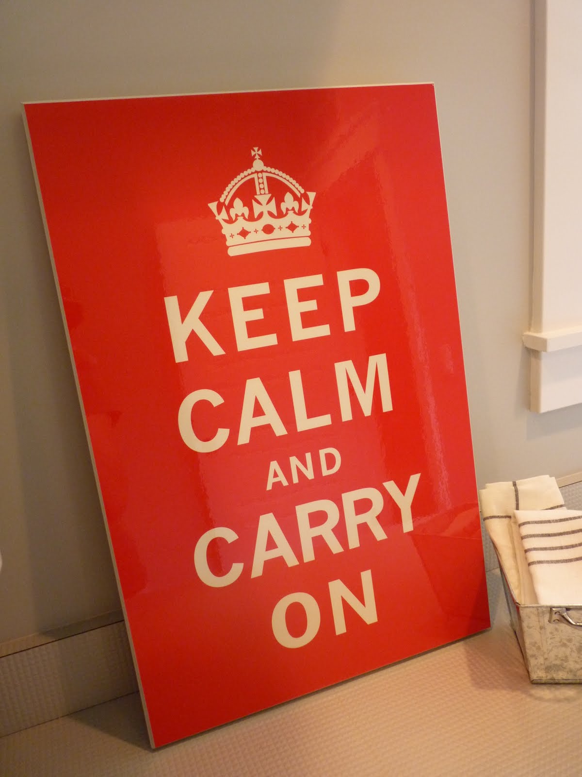
so you already knew i crushed on the crisp, punchy look of a certain war poster....as evidenced in this post of the past.

well i'd actually envisioned it in our laundry room, to start with.  i liked the idea of being able to run in there on a harried day, slam the door shut, take a deep breath [and perhaps a slug, or five, of wine] and let the poster do the talking.  in fact i'd sourced it out in a laundry list of different colors on etsy.  i was leaning toward something in the cool tones....perhaps navy, or lime, or a splash of watery aqua.  something to compliment the cool clean color palette of white + grey.

well.  kinda forgot about hunting it down after moving into the house.  that is, until i stumbled upon this version at tj maxx a few months ago.  ahoy matey!  i don't think i could have come much closer to having the proverbial pop of red.


the price was the same as most etsy poster versions buuut the fun factor here is that its already mounted on a wooden backboard so no frame needed.  between the savings there + not paying for shipping [not to mention that hot red hue] it was a pretty swell deal!

and did i talk bout the high gloss finish yet?  because there's a high gloss finish.  which just so happens to reflect the same shiny sheen as the laundry floor.


definitely meant to be together....and i really enjoy how its yet another element in the room of sparkly clean goodness.


Thursday, July 8, 2010

a slice of key lime pie

once i got our drippety-drop painting hung to the right of our fireplace, i felt as though the skinny slice of wall to the left of our fireplace was craving some attention as well.  and since we'd already delved into black + white territory i really wanted to add visual pizzazz across the way.


so....i picked up a couple of canvases at le lob de hob, a.k.a. hobby lobby, and went to town.  well i went to town first, literally speaking, then i....ok never mind.

i wanted a shade of chartreuse to play off the nearby sunroom flor carpet + ikea pillows. however since i hoped to work with the medium of spray paint, my options were more limited than if i were to use a custom-mixed can of paint.  [but if anyone knows of a way you can get custom colors in spray paint, let me know!] so i scanned through what was available at my local menarrrrds, knowing that bright was the order of the day, and preferably in a yellow or green tone.  and straight out of florida was a can called 'key lime', beckoning me with its neon green brilliance.


trust me when i say that the picture doesn't show quite how brrrright green this baby glows.

so spray i did and after a couple days of tomfoolery in my basement i came up with this pair:


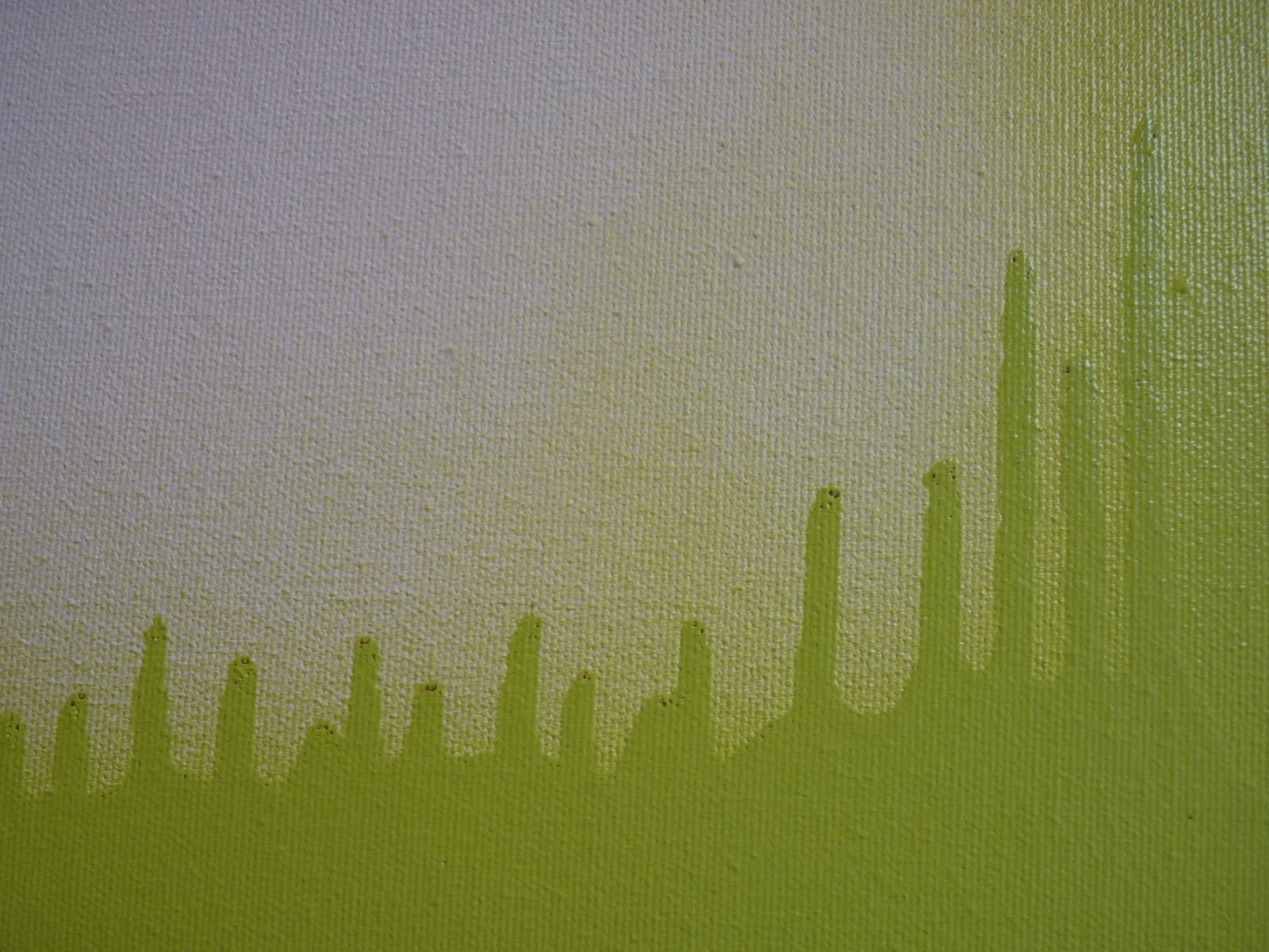
on the top canvas i like how it looks like sound waves.  in fact, i'm hearing the geico music just looking at it.

and the bottom canvas i love for its bold overall impact.  and the way, hung like this, the paint looks like its spreading out from itself from the negative space between the two canvases.


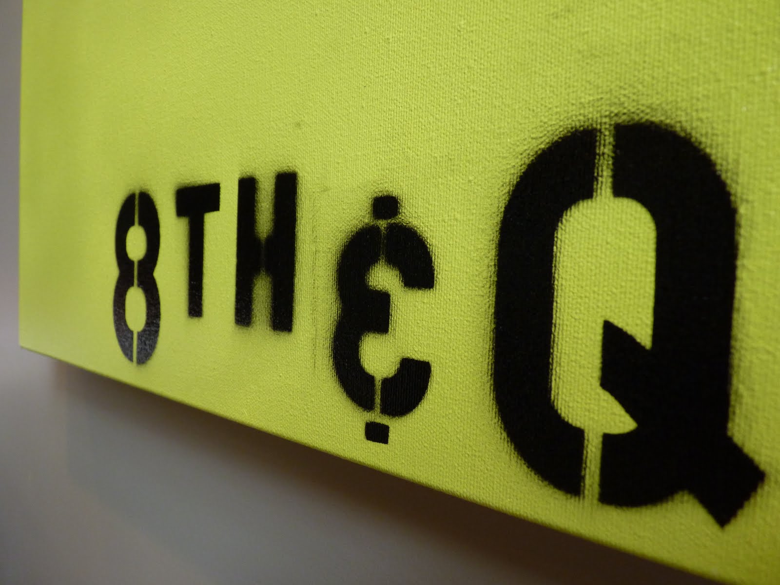
and as for the mysterious 8th + Q reference?  i wanted to include text on this particular piece [let the records note that i feel quite pretentious referring to said project as a 'piece'] but wasn't sure yet what words i'd use. 8th + Q is a local intersection and my hubs actually suggested the idea.  i was smitten from the start and set out to stencil that sucker on there.


i actually really like how the outlines are not crisp in all areas but instead give the blurred effect of an old photograph.  especially the H, which looks like it came straight from an old picture of a city street sign [in my head, anyway]. kevin also gets the credit with inventing our own 'and' sign from a 3.....as the ampersand stencil was too curvaceous for the desired look.

i'm still not positive that i'm finished with the top canvas.  right now, its got that smoky line trailing up the right side, which adds an element of imperfection but also hints at being incomplete.  so, we'll see.  it might still go all california style and get a little work done.

for now, here's our living room as it stands.


+++

editor's note: many toys were relocated in the making of this post.

Wednesday, June 30, 2010

dolla dolla bills y'all

as of late i have become a little bit obsessed with finding dollar store decor deals.

why?

+ no one else usually has it, and i love having unique things

+ there's no pressure for it to be perfect or last forever

+ each item is $2 [ok, just making sure you're paying attention]

+ each item is $1 [for reals]


each of the things i've come upon recently is a kitchen item, or at least i am using the item that way so far.

exhibit a: a few contributors to my current red-green show in the kitchen.

stripey on the left....


citrus punch on the right....


....and vegetable soup, to warm things up with a little humor. [yes, you can stop squinting, the towel indeed says 'veg soup'. just to clarify what that hot bowl of mystery is.]

i love the outline drawings on this particular towel. so quirky-modern to my eye.


exhibit b: a cheapo yet vintagey looking powdered sugar shaker. ribbed for extra pleasure.


exhibit c: a set of twelve votive holders reincarnated as parfait cups

i fell for their modern lines + how they mimic stemless wine glasses [which i plan to try using them as at some point, too]


here they are on duty at a baby shower i co-hosted this weekend:


i plan to try them as vases next. i'm thinking 5 in a line on the mantle with perhaps a single leaf per vase.


so if you add it all up that's $17 [i have two of the lime green towels] but oh so much more satisfaction.