
so....i picked up a couple of canvases at le lob de hob, a.k.a. hobby lobby, and went to town. well i went to town first, literally speaking, then i....ok never mind.
i wanted a shade of chartreuse to play off the nearby sunroom flor carpet + ikea pillows. however since i hoped to work with the medium of spray paint, my options were more limited than if i were to use a custom-mixed can of paint. [but if anyone knows of a way you can get custom colors in spray paint, let me know!] so i scanned through what was available at my local menarrrrds, knowing that bright was the order of the day, and preferably in a yellow or green tone. and straight out of florida was a can called 'key lime', beckoning me with its neon green brilliance.

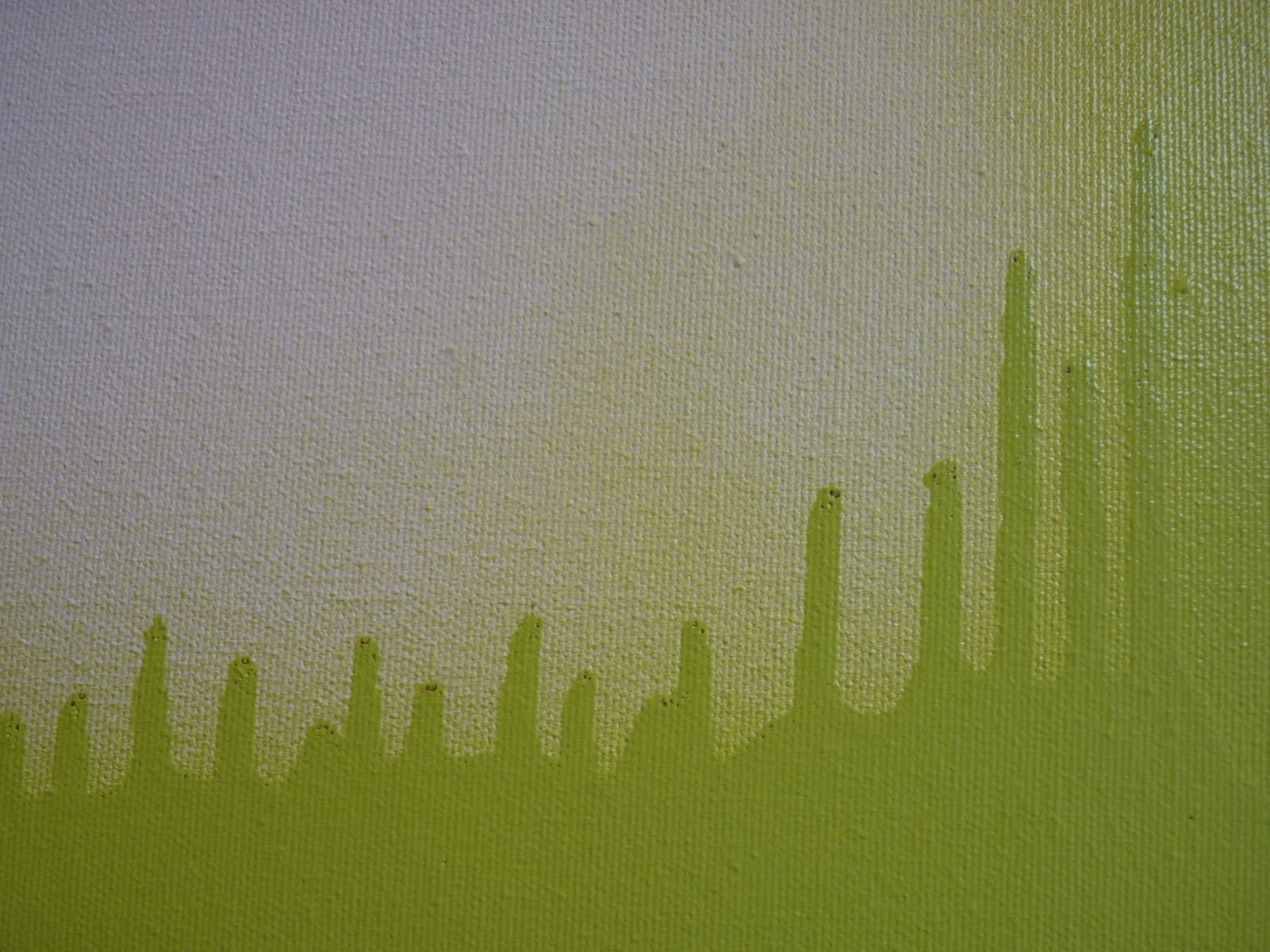
trust me when i say that the picture doesn't show quite how brrrright green this baby glows.
so spray i did and after a couple days of tomfoolery in my basement i came up with this pair:

on the top canvas i like how it looks like sound waves. in fact, i'm hearing the geico music just looking at it.
and the bottom canvas i love for its bold overall impact. and the way, hung like this, the paint looks like its spreading out from itself from the negative space between the two canvases.

and as for the mysterious 8th + Q reference? i wanted to include text on this particular piece [let the records note that i feel quite pretentious referring to said project as a 'piece'] but wasn't sure yet what words i'd use. 8th + Q is a local intersection and my hubs actually suggested the idea. i was smitten from the start and set out to stencil that sucker on there.
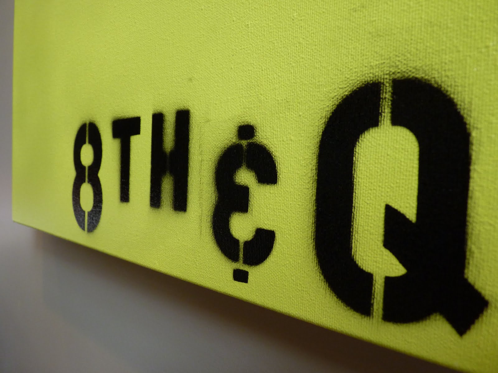
i actually really like how the outlines are not crisp in all areas but instead give the blurred effect of an old photograph. especially the H, which looks like it came straight from an old picture of a city street sign [in my head, anyway]. kevin also gets the credit with inventing our own 'and' sign from a 3.....as the ampersand stencil was too curvaceous for the desired look.
i'm still not positive that i'm finished with the top canvas. right now, its got that smoky line trailing up the right side, which adds an element of imperfection but also hints at being incomplete. so, we'll see. it might still go all california style and get a little work done.
for now, here's our living room as it stands.


+++
editor's note: many toys were relocated in the making of this post.

i love this! plus doing something yourself makes it that much more awesome ;D
ReplyDelete