Tuesday, September 28, 2010

origami. or, origam me?

i can't recall if i mentioned the second set of canvases to grace our home following my last ikea trip, but all the same i'm excited to share them.  like the set in our hallway, they're equally cheap + easy [on the eyes].  except instead of echoing the excitement of city living, these call to mind a more natural environment.


they're ikea's fabric take on origami animals.  totally two-dimensional but just as ready to have a good time.


and next to that pillow pairing?  me loves.

Thursday, September 23, 2010

fee-fi-fo-fall

fall is here! 

....although the weather seems to be acting in direction opposition to that fact.  we're sweating in our living room at the moment, at 9:00 at night in late september. the windows are flung wide + the screens are saving us from a flying fleet of assailants drawn toward our lovely lit living room.

well hey.  we can at least pretend its chilly + cidery outside, right?


i swear i did not place that solitary autumnal emblem there....that burnished brown oak leaf just happened to be in the perfect place for the picture.


mum....mum....mummy....mummy....mom....mom....lois....


look mom!  a PUNKIN!!!!


boy, is it ever tiring staring at beautiful new fall decorations.

now at least i can admit that this post totally turned into a shameless excuse to post baby pictures.  but really, can you blame me?  those cheeks just beg to be documented as regularly as an old man on bran.

Wednesday, September 22, 2010

what comes before part b?

so i threw a little soiree this past weekend.  it was a busy but beautiful few days of planning + preparing culminating in an affair to be remembered.

i thought i'd share some of the decorations i scrapped together....scrapped being code for 'found around the house or made for a total of $10' [not including necessities like some disposable plates, cups, utensils, etc.].

first up: a couple of haute houndstooth takeout containers that hail from my baby shower in february.  they were originally used to house game gifts for me like baby cloths + spoons.


some paper tent signs i made to label the desserts....the aqua houndstooth i had from baby shower invites i made earlier this summer, and the aqua + green 'tents' are envelopes that i cut + folded to be propped up by the various platters.


on one counter, i put two framed 8x10 professional photos of H.  one is black + white and the other had a beautiful pop of blue that worked with the party's main colors of green, blue + orange.  since the party was for H, i thought it was a fun homage and it also meant some more free decor!


also going along with that theme were the orange porcelain koi i pulled from the nursery, and a bit of wild zebra fabric in green + white that i wrapped around a book.  i never did end up neatening the edges + getting everything perfectly tucked as i would have liked, but it still provided a pretty punch in the corner.


let me flag the next little details for you.  i thought it would be fun to jazz up the labeling of the various soups i'd made so i created these pendant shaped flags to go with each main dish.  the paper is more of the aqua houndstooth, and the orange is leftover from the frame project.


i used bamboo skewers from my pantry for the flagpoles + poked them into the back of four little pier one potted grasses [faux, naturally] that rotate around the house on a consistent basis.  i first planned to stick 'em smack dab in the middle of each pot but since the bottom isn't really soil it was much easier to dig them into the small space between the 'plant' + pot.


the center of the island held a cluster of items that went with the general color story of blue, orange + green.  one of our green vases held another of the orange poufs from my february baby shower [are you starting to see that i don't like throwing things away?]

near the pouf i plopped some of the mini moss pieces from the set that i display in our coffee table insert.  the dish is one that my mom gave me for my birthday last year, and the books have no relationship to the party decor other than their cover colors....or in case things got really boring, and people stopped talking + started reading.  thankfully, not the case.


the orange tumblers i'm sure you recognize from recent kitchen posts, and that green peacock of a glass out in front is from a colorful set of handmade dishes from mexico that my mom-in-law gifted us with when we were newly married.  each of these glasses ended up holding bright beautiful wildflowers that i plucked from the woods near our lot.

oh and this guy?  just the star of the show.  no big deal.  pllllllhhhhhh.


are you wondering where i spent those ten bones i bragged about?  ok fine.  here is the tissue paper portion of my tale.


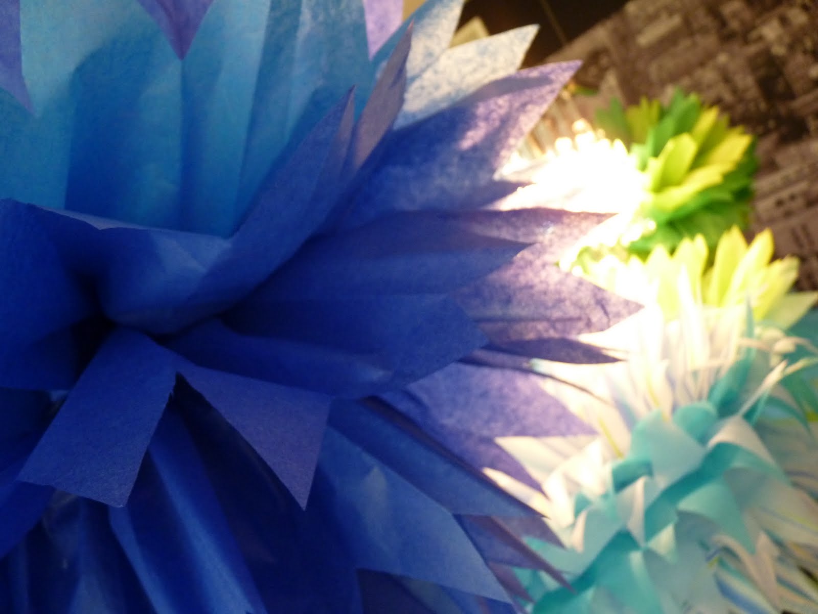
for $10, or two $5 packs of tissue paper, i created more poufs like the orange one mentioned earlier that my girlfriend had crafted for me.  except in more boyish shades of blue + green mainly, with a few other colors to [a] use up the tissue packs and [b] make things not-so-perfect and coordinated.  my attempt at being casual, in other words.  i can pretend to not be a perfectionist, right?


although i wasn't as sure how the striped poufs would end up, since i'd never seen them done before, they ended up being my favorite.


i also took a twist on the usual pouf format by mixing colors in each one to give a little more depth of color, to liven things up, and for the practical purpose of having to buy less tissue paper [since each pack had just a few sheets of each shade].


mmmm.  love.  and for an easy centerpiece on the kitchen table i grabbed the mirrored tray from the sunroom + filled it with reflective items like the votives + coasters so that more of the poufy pom pom color would sparkle.  the coasters were also of course for people's drinks who ate there during the fiesta.  and the green zeeby fabric is the same as the swatch that wrapped the book [above].

lastly i hung a few poufs in the sunroom....


....and in dedication to my dutch heritage, even used the clippings from the pouf production as a simple display of decor on the mantle.  i couldn't let them go to waste, could i?!


i liked how this grouping on the living room mantle carried some of the party colors through from the kitchen, and also how the effect became like a pool of water....with all those blue + green + aqua tones.  and yet the decorations didn't scream 'boy' either, with fire truck reds + construction zone yellows.  it was subtle speak for 'H is a male, but we are not yet to the disney phase....and thank goodness for that'.


all in all, i think it worked out quite nicely.  a lovely time was had by all and it was worth every bit of effort beforehand.


Thursday, September 16, 2010

canvassing the neighborhood

so hide your kiiids, hide your wife, and hideyourhusbandtoo.  if you don't want to hear about another el cheapo ikea decor item, that is.

i've had this particular project in mind for a while, and i'll be the first to admit its not the most creative thought out there as its straight out of the ikea showroom.  but hey, toss me some creds for picking the fabric + placement?  i'm speaking about the fabric-stretched-over-simple-wooden-frames iconic ikea look that is fairly easy breezy and definitely cheapy cheapy.


while i'd had a different idea in mind for filling in the upstairs hallway, as soon as we made these canvases i knew they needed to go straight to the second floor.  they did not pass go.  they did not collect $200.  and they didn't cost nearly $200 either.  

in fact, here's a breakdown:

+ two wooden frames....$5 each

+ one yard of fabric....$6/yard

= $8/canvas or $16/set

not too shabby!  and the labor?  um, free.  thanks hubs!  the canvases actually come with tacks so its a pretty straightforward project.  some ironing, tic-tack-toeing and you're totally there.  and i've got some lovely fabric scraps to play with later, too.

i especially love the sky-liney effect [hey, what isn't a word these days.  i mean, srrrriously] of this particular section of the fabric we chose.


at least, to my eye, its all lofty downtown living like....in an abstract artsy way.  mmmm.  love. 

and i think the slate grey + alabaster white should be long-lasting decor colors to work with.  hot pink or yellow or kelly green would be perfect pops off this palette. 

oh + as for where we hung them?  i like to position wall decor under a lighting source if it works out....usually under an existing can light [to save on additional wiring costs of a new fixture].  so we did just that and now they're the highlight of the hall!

Saturday, September 11, 2010

rhi rhi mix

under my umb-er-ella..ella..ella..eh..eh..eh....

so on this rainy football day i thought i'd do a post with a recent remix in the nursery.  pretty subtle switchup, but it just goes to show how little tweaks in your home's interior landscape can be fun + make you happy.  and that's what its all about, right?


now that we decidedly have a boy [remember, i planned this nursery with the possibility that a little queen bee could occupy it!], i wanted to rid the room of yellow for now and go full bore blue + orange with the shadow box trinkets.

before:


+ after:


i told you.  subtle.  but i'm really enjoying this new set-up so much more from my rocking chair across the room.  there are still varying heights for visual interest and a main palette of blue, orange and some brown to ground things.  isn't it funny how even the paint in this pic appears more ice blue/gray than the picture above?  no i didn't repaint....again....[within a year of building i begged my husband to repaint the nursery for our new babe, from tan to gray].  i think its just the orange lamp that casts a warmer glow in the before photo.

anywho.

i stole the big ben clock from my laundry room, for another old, antique-y looking item in the room. love the chipping paint + aged aqua patina of it.  a garage sale find from six years ago!


and the orange party pouf is from my baby shower back in february....beautiful memories encapsulated in a pretty paper pouf.


and have i mentioned this tongue-in-cheek combo before?  a little GQ reference for my mini manly man.


if you haven't done much in the way of decor remixing in your home, i highly recommend it.  its william wallace-approved free [FREEDOMMM!] + its good for the soul....especially in snowy winter months when you're stuck inside all the time.  and i'm addicted to it, if you couldn't tell!

just call me timba-liz.

Thursday, September 9, 2010

curtain call

so remember this hint from a while back?  [at the bottom of the post] ok just humor me + say you do.

well we whipped up a little headboard project the other night and i think it turned out pretty ok!  especially for free!


we had the thick nautica shower curtain on hand [a leftover-but-not-forgotten-about item from our last house], as well as the plywood [from the construction of our current home] and the tacks [from an ikea project soon to be blogged]. we'd been talking about this simple idea for a while [obv. i mean, the date on that post was JANUARY. as in EIGHT MONTHS AGO.] but the actual doing of it escaped us while we were busy with other areas of the house.

note....the walls seem verrry green here!  
they're not nearly so yellowy-green, i swear!

anywho, c'est fini.  all it took was some ironing by me + gruntwork by the hubs....ie: cutting the wood + carefully tacking the curtain in place so it was taut [like a tiger], with the ribbing lined up as neatly as we could manage considering the seaming didn't run completely straight.


i was going for dramatic so i had kevin hang it up, up, up + away....then wondered if perhaps i scaled a little too much wall with it.  well, i guess i just provided myself a good excuse to need [ahem] new euro shams or oversized square pillows down the road, to fill a little more of that real estate.

what do you think?  fairly dece for a couple rooks in the headboard department?  it certainly works out well considering that company's coming calling next weekend.  now if only i could speed up my progress on the master bedroom from snail status so i could get another side table/lamp going in there for some added hospitality....


at least i did get three of my photographs developed + framed finally.  at the moment they're leaning on top of the headboard but i do think i'd like them more permanently hung right above it. at least now we've got some good incentive....gotta git 'er done before our guests arrive!


Wednesday, September 8, 2010

bloom!

there's nothing quite like cuttings from your own garden, is there??


the front beds were looking pretty sparse at this point in the year so we said 'off with their heads!' to these few remaining blossoms.  and now i can't stop staring at them.  why don't i get fresh flowers more often?!  someone?  anyone??


as if that wasn't enough luscious eye candy for the kitchen, the nearby table holds a few more treats.  held in a few of the tumblers mentioned in yesterday's post.


i might as well be at a tennis match for all the ping-ponging my eyes are doing from one batch of blooms to the other....its adding some serious life to this space!


crystals + cut flowers?  my oh my, company must be coming!