Showing posts with label living room. Show all posts

Monday, August 30, 2010

clear as day

a photo a day....keeps the a.d.d. decorator at bay?

so maybe i'm not switching out mantle-top photos every day of the week, but i like having the setup for it.   i decided on a whim to print some extra [read: non-baby] photos last week while ordering up a good 80 prints or so of the little man. and yes i got the prints for free and yes i am dutch. since its nearly impossible for me to keep things in the same place for long, decor-wise, i thought it'd be convenient to have a frame available that would go with anything + would display atmospheric photos well, to correspond with whatever else is happening in the room at the time.


right now, this 5x7 acrylic frame sits on our fireplace mantle but it could just as easily migrate to another alcove of our abode.  but i'm enjoying the mantle location since the mood in our living room has mucho possibility for change....being that most elements of the room are a neutral foil for a variety of accessories.


i currently have mainly citrusy yellow + green tones flavoring our surroundings.  so first i went for a pop of sky blue....literally....with a photo i snapped this spring. for some crisp + clouded contrast.


after a week or so i decided to go with the shot shown above, that coincided with the existing accent colors.  this pup is a print that hails from a winter trip to domican republic. just what the d.r. ordered, eh?  ehhh?  [har..har....har] i was smitten with this street-side stand spilling over with golden greens + yellows.


future candidates for office include....

strawberry kisses [for a touch of warmth + texture]


wheels [are for whimsy]


cheerful chairs [that tell a story]


....and many more.  the options are endless, really!  and if there's a certain color or pattern i'd like injected into the space i can always seek it out, snap it + print it.  i like the personal story behind each photo as well, that briefly transports me back to the day + place i photographed that particular moment.

clearly, this frame looks to be $12 well spent [finally that 20% off coupon came in handy!].

Friday, July 16, 2010

as we walk in fields of gold

so after jjjjust finishing this post about our living room, i happen to discover a little treasure in our basement.  nothing like going subterranean to add some spice to your decor.


in this case its a little old painting....that to most people might not have any value.  i promptly subbed in this piece + the 3 metallic votives in place of the ikea patterned tin + tory burch candle that had been occupying the space for a while.


i can remember growing up with this in my parents' house though, and i'd forgotten that i inherited it when they downsized their home.  to my eye, it has a simple charm.  somehow the spattering of simple brushstrokes captures my gaze + transports me....and i rather enjoy the rough wooden 'frame', if you can even call the simple edge pieces that.

sometimes decor really is at its best when its simple, and meaningful.

now if only i could get that sting song out of my head.


see the west wind move like a lover so
upon the fields of barley....

Thursday, July 8, 2010

a slice of key lime pie

once i got our drippety-drop painting hung to the right of our fireplace, i felt as though the skinny slice of wall to the left of our fireplace was craving some attention as well.  and since we'd already delved into black + white territory i really wanted to add visual pizzazz across the way.


so....i picked up a couple of canvases at le lob de hob, a.k.a. hobby lobby, and went to town.  well i went to town first, literally speaking, then i....ok never mind.

i wanted a shade of chartreuse to play off the nearby sunroom flor carpet + ikea pillows. however since i hoped to work with the medium of spray paint, my options were more limited than if i were to use a custom-mixed can of paint.  [but if anyone knows of a way you can get custom colors in spray paint, let me know!] so i scanned through what was available at my local menarrrrds, knowing that bright was the order of the day, and preferably in a yellow or green tone.  and straight out of florida was a can called 'key lime', beckoning me with its neon green brilliance.


trust me when i say that the picture doesn't show quite how brrrright green this baby glows.

so spray i did and after a couple days of tomfoolery in my basement i came up with this pair:


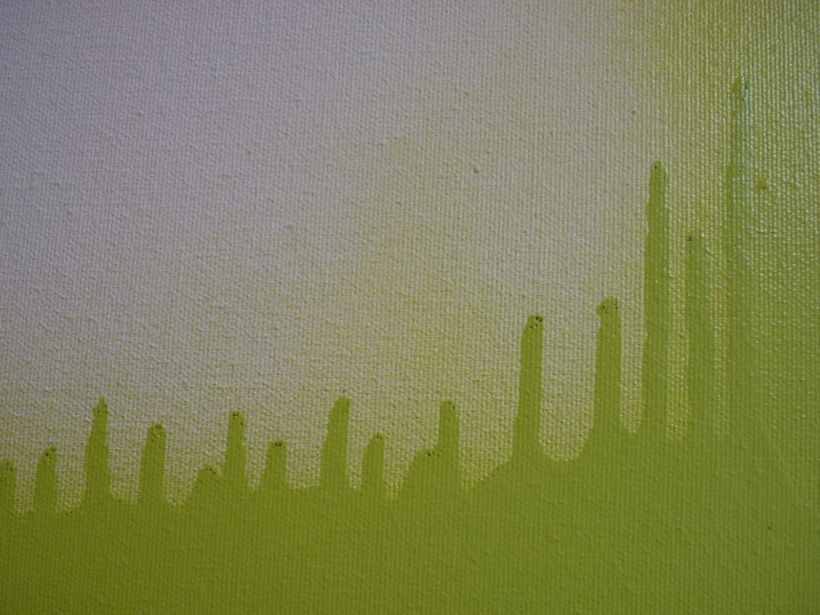
on the top canvas i like how it looks like sound waves.  in fact, i'm hearing the geico music just looking at it.

and the bottom canvas i love for its bold overall impact.  and the way, hung like this, the paint looks like its spreading out from itself from the negative space between the two canvases.


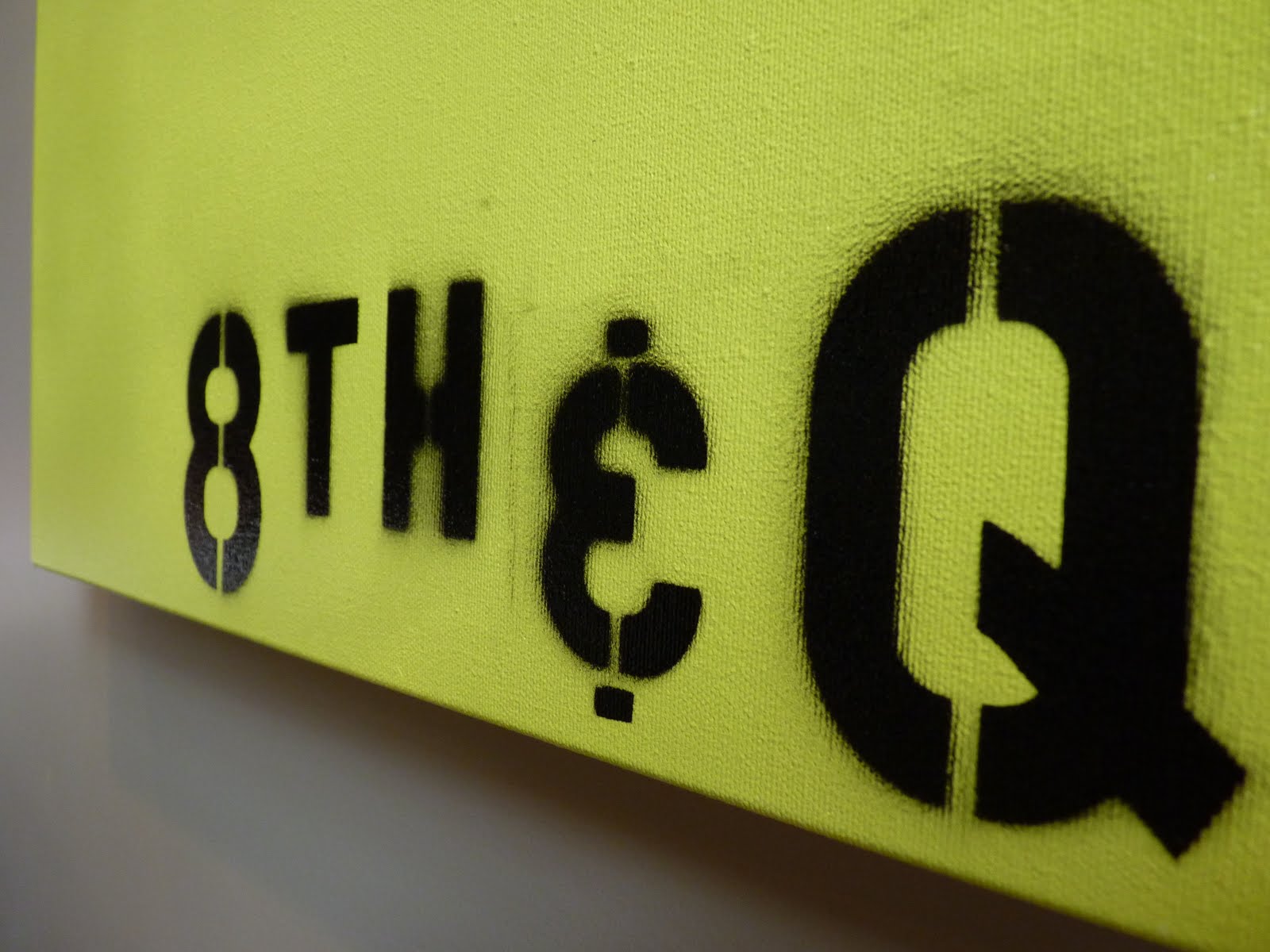
and as for the mysterious 8th + Q reference?  i wanted to include text on this particular piece [let the records note that i feel quite pretentious referring to said project as a 'piece'] but wasn't sure yet what words i'd use. 8th + Q is a local intersection and my hubs actually suggested the idea.  i was smitten from the start and set out to stencil that sucker on there.


i actually really like how the outlines are not crisp in all areas but instead give the blurred effect of an old photograph.  especially the H, which looks like it came straight from an old picture of a city street sign [in my head, anyway]. kevin also gets the credit with inventing our own 'and' sign from a 3.....as the ampersand stencil was too curvaceous for the desired look.

i'm still not positive that i'm finished with the top canvas.  right now, its got that smoky line trailing up the right side, which adds an element of imperfection but also hints at being incomplete.  so, we'll see.  it might still go all california style and get a little work done.

for now, here's our living room as it stands.


+++

editor's note: many toys were relocated in the making of this post.

Sunday, November 29, 2009

in living color

so its been a while since i looked at the living room with you. we've come a long way from a naked fireplace, a hefty dose of burbur and a hard-to-put-your-finger-on shade of gray paint. [the name is rockport gray, thank you very much].


as you can see we've filled in the cracks a bit and made it all feel a lot more like home. to off-set the white built-ins bookending the fireplace, and the tidy white trim 'round all the windows, we loaded back in some of our darker furniture pieces including a couple targey specials - the side tables flanking sofa numero uno. and you can't miss the 4x4 in the middle of the room. of the table variety of course.


its a coffee table with an identity crisis that we caught our eyes on while perusing
world market's fares four years ago. its got the signature west elm overlapping squares which make me weak in the knees, with the zen-like simplicity of an asian gathering table, all wrapped up with a cost plus label.

speaking of squares, there's a new splash of color peeking out from under all those right angles. didja catch it in the image above? that black box, believe it or not, has for the large part remained empty for the almost five years we've owned it. until now! thanks to a stroll down dutch grocer [slash-everything-and-the-kitchen-sink-store] meijer's aisles, we're now the proud owners of fake moss.

ok, i'm the proud owner. kevin's the begrudging owner who's wondering when woodland greenery became an indoor item.


that green pop o' color provides just the perfect accent in the room. a shade or two brighter than some of the other forest + citron tones in the room, its a fun bit of interest without overwhelming things.
you can see a couple of them here. in the two-tone olive pillow + and ziggity-zag striping of our new ikea throws [$8 each on clearance, holla!]. while we're lingering here, i've got to comment on the zany contrast created between the missoni-ish stripes of the blanket and the feminine floral prints of the pillows. i love setting male against female + modern against traditional this way.

if you're lost on the missoni mention, here's a visual hint.

via stylebyme

quite similar, no? this bit of luxe lusciousness is from the missoni hotel [please mommy? can i stay?] and the majority of their fashion lines contain comparable patterns and equally exhilarating color schemes.

in other details around the room....let's talk coffee a moment. or coffee table toppers, to be more exact. i admittedly have room for more friends up there but for now i'm enjoying the minimalist look of three favorite covers and the aforementioned moss.


i point out these pretty publications because they're randomly selected and and basically....i just like them. a lot. the audrey hep book was a house-warming gift from my
bestie that fits into our abode like a ga-love. i love the stark b+w image on the cover + the simple orange title. and, its audrey. i mean, need i go on?

next up is the
chicago brides magazine. random? yeah maybe. it was given to me by a coworker that knew my love of fashion....boy was she right that i would L.O.V.E. many images throughout this mag. the dreamy grey grown on the cover makes me drool and the train detailing is otherworldly. the icing on the cake is the b+w background that correponds oh-so-well with next-door-neighbor audrey's book.

last up: the book of interiors. again, i completely judged a book by its cover and bought this baby from
barnes + noble based on the first image alone....and the hope that there'd be some more interior inspiration within. the cluster of vases, the intricate lamp, the soothing + sophisticated colors....


let's swing around to the fireplace now. those translucent
ikea vases are like a puff of white smoke alighting the dark wood mantle.


since the tv and speakers carry some visual weight of their own, i kept things fairly light on the other end too. three sleek stainless vases, also a meejer [clearance] special, and a stack of books that just happen [wink!] to work with the li
ving room palette, plus a little orange zest.


some side-table sights: a little dose of amber, citron and lemongrass next to that shiny glass lamp + the sparkly mirrored coasters. miscellaneous accents picked up from around town over time.


and last but not least. a barren stretch of wall to the right of the fireplace just begging to be dressed up.

that's where this mystery piece comes in.

if it looks like i found this piece of art in my basement....well, i did. and by that i mean, that's where i made it!

+ more to come on that later. stay tuned! +

so hopefully you enjoyed the room tour and my choices thus far. definitely not finished, but getting there.