Monday, May 9, 2011

color splash

so yesterday when i was playing with the little man, this happened.


roy g. biv, meet H.


H, meet RGB.


we had fun sorting colors, or mashing them together.


and, this just in: i am starting to love color.  not just a little but a LOT OF COLOR.


i always use to think the kiddie toys would drive me crazy. give me the constant urge to throw them all in a closet + slam the door shut.  walk around with blinders on.

but i'm actually kind of loving it.  in fact, its inspiring.  life with color is ever so full + happy feeling.  it makes me want to paint the town red paint the whole house white so that all the bright toys can truly pop.  am i crazy?  probably.  maybe.  but i'm also just proud to be a MOM.  [happy belated mother's day, everyone!]

Wednesday, May 4, 2011

when in doubt, go in the closet.

not to sulk.  not to hide.  not to play hide + sulk.  

you could play hide + seek though, if you're into that.

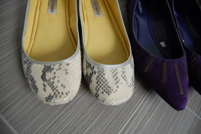
what i mean is, when you're stuck for a decor scheme or theme or anything in between, take a minute to go into your closet and see what it speaks to you.  i kind of did this in reverse when it came to my master bedroom.  as i was looking around the mostly-completed room [* no room is ever really complete to me!] i realized that my shoe collection was represented surprisingly well in the decor.  


here's an example.  

all of these shoes [which aren't ALL of my shoes, as the hubs would be quick to point out....hey i buy them cheap, folks!] were purchased anywhere from a year to six years ago so it shows that your taste kind of curates itself.  as you change + your tastes change + you shop + you make your goodwill deposits.  or goodwill collections, as the case may be!


see how various elements are all picked up here?  the strong + traditional deep brown wood tones of the bed + garage sale table.  the circular motif of the shelves + the side tables.  the glitz + glitter of the silver lamps, tory candle, garden stool + chrome legs of the chairs, and the gold + purple pops of color scattered throughout the space.


yummy.


kind of neat, right?  

its always fun to appreciate the details of how your clothing + accessories compliment your home, since they reside there too.  especially when you're looking at these feline footies....meeeeOWWww.


now you might look into your closet + say, all i see is a deep dark blackity-black hole.  and not because you're blessed with an amazingly ginormous closet, but because all you buy is black or neutrals.  fear not!  it probably speaks to either your love of accessories, that pop off of black + neutrals so well, or, your love of a beachy chic vibe or pared-down fresh country aesthetic.  and either of these realizations is a-ok too.  in that case layering is the key so that you still get a really rich looking space....ie: lots of texture + patterns [subtle ones even, in different sizes] like sheepskin, various wood furniture pieces, canvas or grasscloth materials, and matte + laquered pieces.

like so.


see all the cozy creamy whites layered here?  the painted brick, the slipcovered furniture, the throws, the lamps + lampshades, the cushy rug....

or like so.


see all the moody blues + contrasting textures here?  the wood slatted boards, the thick knits, the gobs of throw pillows, the canvas-ish chair at stage right....ya i'm picturing the owner of this home wearing blue jeans + comfy sweaters fairly frequently.


so hey.  do i read too much into things sometimes?  [like are you thinking, SHOES LIZ?  THEY'RE JUST SHOES!]  yeah, sure.  probably.  ok definitely!  but if it helps to get you thinking about your own design sensibilities a bit....and inspires you at all with your own home....then i'm glad i could help.

because i'll still be over here reading into things too much, so at least now i can tell myself its productive behavior.

Sunday, April 24, 2011

she said, he said.

there is one part of the master that got left out.  in print + in reality.  and its this lovely little light fixture.


isn't it just the most amazingly hexa-penta-octa-whatever you call it?!  um, I KNOW.

well there was someone who didn't quite agree, and since he shares our home, and well built our home, i have to give him a little credit + take his opinion into consideration too.

let me explain why i loved it for our bedroom.  it was a marshalls special, first of all, and you know i loves me some marshalls.  ok lots of marshalls.  ok marshalls as often as i can justify stepping foot in the store.  its from the ralph lauren home collection and the suggested retail was something ridiculous like $450.  ya.  uh huh.  and we got it for $150, thanks to the eagle-eye spotting of my very good friend.  so needless to say it was a great deal in terms of high quality, high style lighting pieces.  but mostly, i just loved the look of it!  the modern geometric shape with the classically glamorous pale gold color....the sleek connector pieces....the exposed bulb position in the center....


i thought it would be such a fun sculptural item to hang either centered over back of the bed....


....or off centered over by the shelf + chairs in the corner.  see that space there dialing 1-800-HOT-PENDANT?  yep, to my eye, that corner was calling ralph's name loud + clear.


it even played so well off the side table bases.  see?


and don't forget the fun diamond like shadow that is cast over the bed [see above picture].  that would have been a fun tie-in as well.

but i have to give the hubs props, because we do pride ourselves on doing decor as affordably + diy as we can, and saving every dollar that can be saved.  so to allocate $150 on one light [plus the cost of an electrician hard-wiring it] when the room is already looking quite swell....its true, we really can live without it. 

barely.  

ok no really we can.  i just might sniffle from time to time thinking of all those sexy angles + that sultry sheen.   but who knows, maybe the hubs saved my life.  it was an extremely heavy pendant + who wants that crashing down on their noggin as they dream the night away?  not i!


+ + + 


ps. emily, are you listening?  this fixture would look amazing in one of your spaces.  better make a trip to michigan asap.  just sayin'.  oh + thanks for sharing your talents with us each week on secrets from a stylist!

Tuesday, April 19, 2011

the master!

i feel like our master bedroom now glitters + winks at me each time i peek down the hallway at it.  see it there through the doorway, saying hello?  enticing you onward?  beckoning you with its come hither throw pillows?

bla bla bla; ready for pictures?  i thought so.


here we go!


you likes so far?

so the colors in here ended up being a story of neutrals....white + a bit of black, grey + a bit of gold, silver + a bit of brown.  with a dash of mustard + eggplant.  you know, to keep things yummy.

you might recognize some pieces that migrated their way in here....but there are also a few new friends that joined the MBR crew.


we moved the lack coffee table from the sunroom to the end of our bed....and the white eames repro chairs have taken up residence in the corner.  along with the silver garden stool from our bathroom.

but the circle du soleil happening above that arrangement is all new.  as in, handmade by +the new house+ crew: the hubs and myself.


here are a few more angles of my new favorite item in the house.


so how'd we do it?  its actually an idea out of a recent countryhome issue, from the authors of home from the hardware store.  i guess it never hurts to step out of your usual comfort zone....seeing as i'd normally never be perusing a country style magazine.  but it worked out for me this time!  basically it involved cutting down concrete form tubes....the hubs handled that part....and wrapping them in woodgrain contact paper.  and making up an organic arrangement.  and screwing them together, and hanging it up as our new wall art slash functioning shelf!

i. am. in. LOVE.

the fact that we made the piece with our own four hands + it was cheap + looks so totally unique + modern....well....enough said.

now while we heavily debated craigslisting our bed [love those new verbs nowadays, ehhhh kids?] + getting something more sleek, in the end, i'm really happy with the warmth + height + structure that it gives to the room.

see those fun diamond or hex-like shadows on the ceiling?  i actually never notice them myself in person but i'm loving them in the photo here.


i'm not sure the effect translates here in pictures, but the room just seems to glow with warmth + calm.


did you think warmth could happen with gray?  i'm telling you, it can!  this particular coverlet came from meijer of all places....our twenty-four hour grocery store, for you out-of-towners....and the basketweave sort of stitching and dove gray shade both look soft + inviting....vs. cold + stark like you might expect with gray in the boudoir.

the lamps, which i've mentioned before, have an almost molten appearance.  like liquid light.


and the curtains which we plucked from ikea seem to mirror the dimply waves of the lamp bases.  [i'm talking about the pattern, people!  i KNOW the wrinkles are there, i'm just pretending i don't need to iron them]


even the lampshades want to get in on the swirly fun.


the bedside candle is a voluspa i picked up from a local boutique store at the mall for a great price.  i love their art deco-esque candle tins and i lurrrrrrve this particular scent: blanc suede.  its like there's a faintly cologne scented tuxedo jacket draped nearby, fresh from a glorious evening black-tie affair.  or so my brain tells me, as i drift off to sleep.


lets see, what other details haven't we covered?

well the other art in the room was switched out with our hall canvases, since the grey worked much better than uber bright citron yellow. 


the throw on the lack bench [a tj maxxionista find] adds a little more luxe, and its working as an in-between while i hunt down the perfect bench cushion fabric.


the mustardy gold scarf on the chair adds more warmth + color + ease.


and on the refurbished dresser, an eclectic mix of gold, silver and the aforementioned purpley eggplant.


were you astute enough to notice the jaggedy ann candle going on in the photo above?  yes my tb candle had an encounter with a one year old, and you can see who won.  and you can guess who cried.  ok it was more of a screamy yelp....a strangled screlp sound....but thankfully no one was injured and it still sortof works as a decorative item. 


so thats how things are looking at the moment, with a few things yet on my checklist.  such as the bench cushion, and a touch more artwork.  i dig that this necklace sort of describes the whole space: clearly contemporary with a mixture of metals, light and dark, hard and soft, and ok i'll stop now.