Showing posts with label dining room. Show all posts

Sunday, July 18, 2010

twisted sister

this bunch of twisty branches on our dining room console table is adding just the sweetest bit of wild to an otherwise crisply defined room....


its just a few remnant curly willow sticks left from our wedding reception.  i know, i know.  me + my free decorative accents.


gotta love stickin' it to a space using sculptural branches though.  i've actually got a few more on tap that i've got to find a place for still....i need to decide whether i want to paint them or dress them up somehow.  more on that later!

Sunday, November 22, 2009

dishing decor: the dining room

so since my energy picked back up and our busy fall schedule slowed down, i've actually been able to get some things accomplished around the house. let's start with the dining room. even with the ikea torsby table we'd added early on....she was looking quite sparse.

so the first edition? these puppies.
the zebrano chair from world market....i'd include a link, but alas, they've already been discontinued. unfortunate too, because they added such a fresh modern feel to world market's usual scheme of dark + exotic decor pieces.

they're surprisingly comfortable considering their lithe frame and you know i'm loving those chrome legs. but it was really the zebrawood grain that first caught me eye....eerily reminiscent of a chair cb2 had sold in the last year or two, right down to the extremely reasonable price. they add a lovely crisp contrast to the cloudy white glass table. i also wondered about the scale, but the legs have a good wide stance and they fill up the table juuuust fine.


if you were starting to crave a little feminine feel in the room, check out these curvacious cotton curtains:

when you take a step away the hourglass shaping really pops. a nice organic juxtaposition to the hard square lines of the window grids and coffered ceiling.

as for color....i know, i know. thus far, the room definitely airs more on the sophisticated side of greys + whites and doesn't dabble too deeply in the color realm.

save for some fun new accessories. a little mix of spunky patterned tins and a burst of red via the quaint little journal propped up there. [the latter came courtesy of my mom as a birthday gift, upon her finding out my love of this classic war poster]

and just outside the formal dining room is this newly created nook. as you move from the foyer, between the dining + staircase, toward the kitchen there's a place to rest your tootsies or set your purse, should you need it.
a couple grey tweed target pillows from a couple years ago....which admittedly could have used a little more pre-photo floofing....two houndstooth cubes found randomly at tj maxx, and a partridge in a....er, an $8 poster in a frame and voila! new focal point!

i especially love the playful homage to binary code. because i'm sooo computer savvy and all.
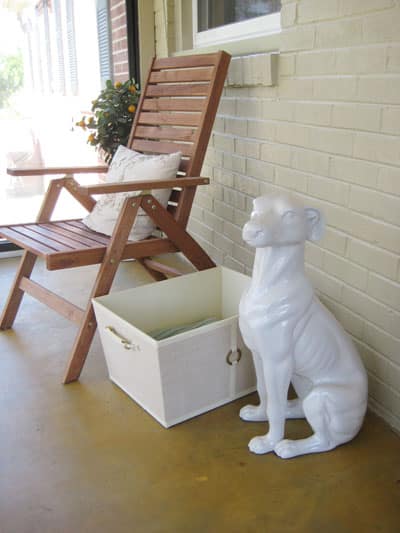
still to come for the dining room? some sort of rug....either an accent color or something with subtle pattern that coordinates with the existing elements. and possibly a couple taller items, to sit on the floor, that bookend the console table and flesh out that wall a bit. a pair of pooches like this would do just the trick.

Thursday, August 13, 2009

i've been dining to see you

while our dining room is far from complete, decor-wise, its come a long way from the little design seed that first sprouted in my head.

something appealed to me about having some 'grown-up' elements that would make our house a little more transitional of a style and not purely modern. in particular, i really loved the thought of having coffered ceilings....but i did want them to be done in as simple a way as possible so that the lines would still be clean + pure.

here are the first stages of the dining room ceiling being framed in....it may not look like much to you, but the sight of these beams had me thrilled with thoughts of what was to come!

you can also see that we were able to save some cash by not using 'real' beams but instead by having them framed + drywalled in like so....

shhh! its our little secret.

at the final stage here [in this slightly blurry shot, sorry!] you can see the paint applied. crisp, fresh 'superwhite' on the ceiling contrasting with cool, dark charcoal 'grey' on the walls....both by benjamin moore. superwhite may be a lot scary for a lot of peope but i wanted our trim, cabinetry and ceilings to really pop and to show as true, bright white.

i am also super pleased with the sheen shown here on the walls and ceiling. we chose to go the way of eggshell in this house, hoping it would scrub up better for future kid phases than our previous home's ceramic, matte paint did. while we really enjoyed the matte finish, we're finding so far that the eggshell gives a great depth to the wall colors throughout and it also contributes a bit more glam feel to the house. we're really happy with the choice so far! [it was also a cheaper option than going with ceramic....love that]

backing up a little, here is a view of the pillars that frame the room on two sides. not surprisingly, i wanted the pillars nice and plain....but also bold and not flimsy looking. they measure 12"x12" around the main pillar and of course the trim adds a little width on top + bottom.

i like that the large scale of the pillars helps to close off what is potentially a very exposed formal dining area.

the first + last pillars are made to have that built-in-to-the-wall look....ie: they're not full size

hanging out amongst the squares of the ceiling is our double drum pendant, another restoration hardware beauty.

here you can see how the exaggerated squares on the ceiling are somewhat reflected in the paned look of the front window....even though each pane is technically rectangular.

parting glance. our little friend in the corner there is a 4'x4' canvas pier one print kevin gave me for christmas when we lived in our first house. i'm loving the look of it in this dining room.

and lest you think this room will sit empty forever, fear not! we did already find one treasure that'll sit right in the middle. her name is torsby and she is equal parts glossy white glass, shiny chrome and sleek minimalism.