Friday, June 11, 2010

nursery works: part three, i

so on the window wall of our nursery, a.k.a. the west wall, or the wall opposite the doorway, i knew pretty early on i'd like to have this locker unit from ikea to serve a couple functions....both storage for books + toys for our new l'il roomie, and a surface for display as well as setting books + water glasses next to my rocking chair.looks totally crisp + white + oh-some, right? wellll i don't know if its the lighting in ikea or the finish they use on much of their white merchandise, but, it sure looked pretty yellowy to me when we actually stormed the store to pick 'er up. major disappointment. i was hoping for the white to add some polished panache against some of the other tones in the room. thankfully at the time they also sold a grey option which i thought could be sharp as well, and just as neutral gender-wise. i also liked how the grey upped the utilitaritan factor even more. basically it looked like i backed a truck up to a local elementary school and ripped it right out of a classroom. totally bad+ss.

my kid will thank me. someday. i mean, he will. right??!

what i also like is that the only way to keep the doors from swing swanging open is to actually lock them with a little set of keys that comes with the unit. while this may seem cumbersome, i like that it'll enable me to keep things somewhat in order + stowed vs. allowing baby h to rip all the books off the shelves just for the fun of it any time of the day. which i've heard kids like to do.

and now that baby h is here, i do like that the grey of this sideboard boasts a bit more of a male edge. not that i don't love grey in girls' rooms too, but i think this particular piece looks a little more manly this way.

now i couldn't move on to curtains + lighting without talking toppers, could i? as in locker toppers?? as in, the fun stuff??!

here are some of the fun trinkets and tchotchkies that warm my heart each time i enter the room:

+ mini iconic orange chair [normally sold for $12 msrp, i found at a sale price of $4.99, clearanced to $2.50, and bartered the price down to $0.99 since the legs had come apart from the chair + needed to be tlc'd ie: superglued back together]


+ silver squirrel mug i myself drank out of as a wee babe


+ areaware twice clock [once....twice....THREE TIMES....a laaaa-dyyyy] original price was $100, bought on one king's lane for $5 after discount + credits. let me know if you would like an invite to okl, its a great site for designer bargains! such as this two-faced 'twice' clock that can actually hang perpendicular to the wall like a train station or school clock. and since its so chunky + rectangular, it can also just sit on its end or side without needing to be hung at all. if you have some spare minutes do check out the fun areaware website with its sweet urban nyc vibe.


+ handmade beaver-squirrel-totally-cool-puzzle-thing. a friend of ours graced us with this gem making it even more near + dear to us


+ superbad bunny brush set. white + orange + functional fun. alongside....


+ hardcover books, nice + neat with their white bindings.


+ ikea tin [yes, you've seen this pup before] and metallic owl bank. that sounds like a band, doesn't it? metallic owl? hmm, having deja-vous there. the bank was a steal of a deal at $7 on the clearance shelf at tarjay. love the vintagey quirk factor.

and what do those items all have in common? nothing, necessarily! but to my eye each is playful in its own right and relates either scale-wise or color-wise to the rest of the group, so it just....works. especially for creating an eclectic kid-room feel overall.

so who put the pom in those pom-pom curtains that keep popping into my pictures? my mom + i, that's who! while i love the length, simplicity + grommeted tops of these ikea curtains for the nursery, they definitely needed a little spice to liven them up + tie them into the room's decor. i first laid eyes on fun retro orange pom-pom trim on etsy, but later snagged a cheaper [read: no shipping fee] version at my local fabric store.

thanks to my mom's trusty jetson-esque singer sewing machine, circa 1940-something that is, we got those poms wrassled down to the curtain panels in no time at all. talk about injecting a little vintage into a room! this machine is a beaut:


in this shot you can really see the second face on the twice clock, and the chunky white profile that is sandwiched by the light grey facades.


also dying to get in on the pom-pom-a-tini action? this light fixture i snagged from the same antique shop where i found the fun foursome of wooden apples.

while perusing the store i saw its [originally] ivory chipping paint + greek key inspired patterning and instantly fell. right onto my credit card, which swiped faster than kevin could say whatdidyouspend$40onatfound?! i just loved the swagger this fixture walked with and knew a punchy color could make it totally gender neutral, since the cream colored paint it was clad with at the time made it decidedly more feminine overall.

indeed, i discovered this lovely light with its pommish trim before hatching the curtain idea, but i think these two elements get along swimmingly.


that poppy orange color was no accident, it was sprayed on by my helpful husband as i was pregnant and fearful of fume inhalation. i was going for bright + funky and i think this shade captures that! ....especially in contrast to the calm, pale grey walls.

i also swapped out the shade for a fresh retro one from menards, that you see above, as the round bulb shade it came with had a flaking floral print on it. not so neutral, no?

and on that note....i must admit defeat. while i thought i could conquer my nursery posting in three total posts i apparently have the gift of gab and it's going to take one more. i'm sorry. forgive me. and read on, blog-pal-warriors! more to come.

Wednesday, May 19, 2010

i knew i loved this woman.

and now i'm crazy about her crib, too. i'm talking jenn ski, creator of the alphabet art in my nursery.

[yeah i know, i'm severely behind on finishing up my nursery post. i'm actually finalizing one more l'il project for that room + then the third and last installment will be up for your viewing pleasure.]

today i saw a post on apartment therapy regarding said ski and her marvelously mod palace. check it out here....and be sure to note the Naguchi, coo over that coral wall, and have eye-spy envy for pretty well everything you see.

Saturday, May 8, 2010

nursery works: part two

so back to the nursery.... which has a new occupant!

i already waxed on about the east + southeast walls of the nursery so i'm moving on ahead to the south wall next.

as you recall, i wanted to do a something with les lettres de l'alphabet....but i had a big beef with doing something spelled out or perfect looking. random was the order of the day....and yes this snagged me at least one comment as to how my child would be scarred for life in the reading department. [c'mon, this english major mama would never allow that, would she?!]

so as time ticked by i kept my proverbial eye peel on and gradually built up a pretty peachy assortment of letters to post on the wall for baby h to enjoy from his or her new nest.


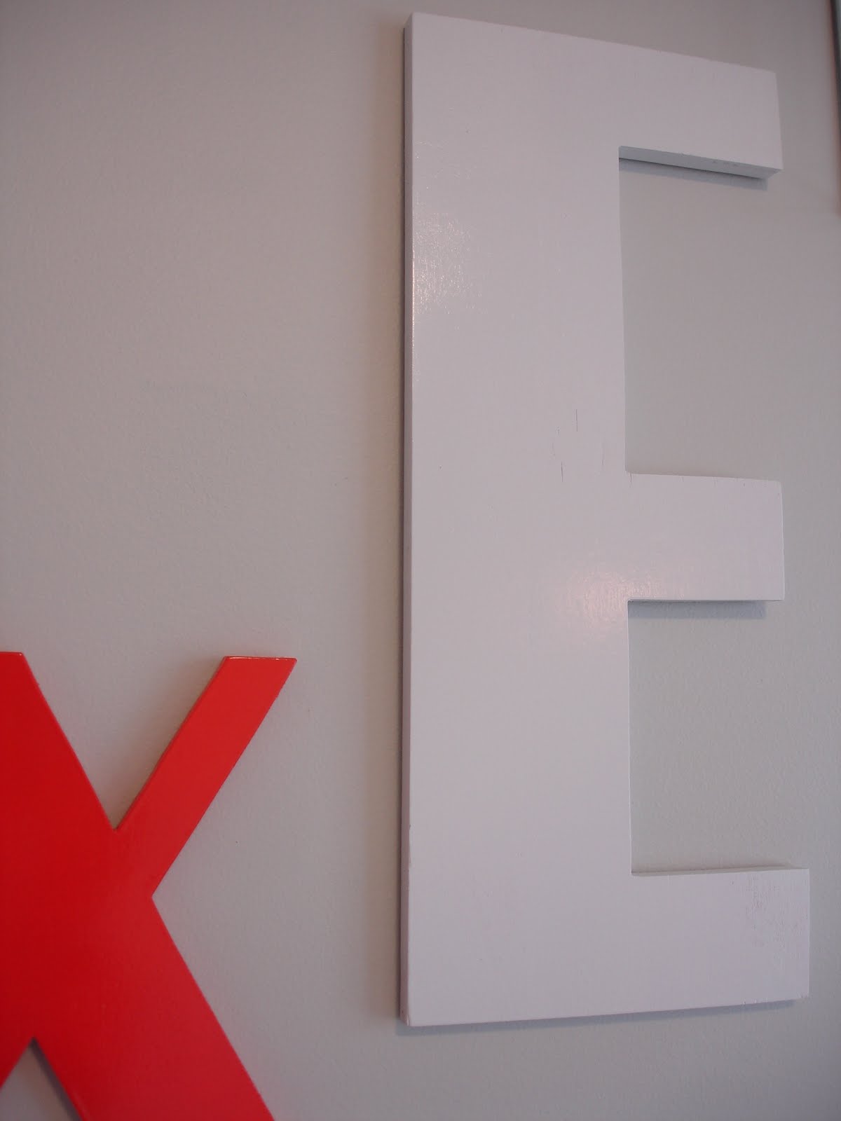
first up was actually a giant e that my girlfriend eye-spied for me at a local antiques shop....which to this point hasn't been hung in the room. [i'm thinking now of hanging it in the kitchen instead as an ode to e, aka me, as well as a subtle nod to the word 'eat'. stay tuned!] after that followed the big b and e, which i picked up on clearance at urban outfitters in lansing. conveniently done in unfinished wood, so i knew painting them to fit my scheme would be a breeze. next in line line were the m, a, x + k found at another urban outfitters in downtown chicago. also on clearance, also thrill-inducing for me [i believe i paid $5 each for the big letters, and $2 for the smaller letters. scorrrrrrrre lady with the drool all over her face!] i had actually seen these 4 letters before online, for 4x the price, in their psychadelic graphics and decidedly girly colors. nothing some primer + paint couldn't de-prettify! and don't you just die for the font style on that e?


after that the alphabet ensemble grew with the finding of the chunky metal h at another antiques shop, this time in downtown holland. they had a few letters here and there amidst the pile of pieces new + old and when i saw the h i had to have it....he was a broken l'il guy but that made for a perfect bargaining scenario for moi. next thing i knew he was half-price + coming home with me! around the same time i nabbed the mini u from the counter of a restoration hardware outlet store that was clearing out holiday items. yup, she's a christmas ornament gone walled. with a quick removal of the string looped through for tree-hanging, no one's the wiser. oh and price? a whopping $0.49.

last in line are my favorites of the whole flock. with the wiry architectural t + f, it was uo striking again. [why does that sound like some sort of who's on first riddle?] in retrospect, since i wanted an eclectic mixture of materials, letters and styles i would have gone for the capital Q they have or one of the more rounded letters to add a little curvaciousness to the mix. but at the time i had a guy feeling....er, GUT feeling [that was a true typo folks!] we were bearing a boy and i wanted the significance of the f for his middle name, and the t for my maiden name.

enter mr. t. i had no idea i'd be getting this gem of a diamond. its an antique heavy metal piece my dad came across in a little shop on the coastline of nova scotia, his home province. so as you can imagine, this one comes chock full of meaning for me....my dad has had it for years. i love the rough rusty exterior and the tips on the t.

so here they are! the motley crew.


as you may have noticed in the first photo of this wall, the koi fish bedding was a go for launch! yeeeee!


i'm so pleased with the end result. i'm even more pleased with the fact that my child is actually sleeping on said bedding now, after a month of bunking it with me. these guys are pumped too, can't you tell? lefty lucy is a sweet birdie i'd registered for at land of nod, and right mctighty is a speckly orange cow i couldn't turn away when he called out to me from a shelf at target.

and as for the crib....yes we did complete our desired duo by ordering the olivia babymod model from wally world, a generous gift from our parents for which we're so grateful.

mmm. pebbles + peg legs.

oh! and lest i forget the quilt me madre sewed for me about 5 minutes after finding out our news back in august.

even though i wanted a pretty clean color palette of mainly white, orange and some grey, the patterned print on this fabric was too tempting especially at a discounted price [since there was a miniscule stain on one section of one yard]. thank you mom! i also appreciate how it echoes the moroccan tile print of our foyer rug just one floor below. there is a slight floral look in this fabric but i thought it walked a fine enough line with the over-arching pattern being bold, and nary an actual blossom to be found.

next up: to the windowwww....to the wall! 'til the .... er ....

i'll leave it at that.

nursery post three coming SOON!

Thursday, April 29, 2010

one month + one new baby later.

view from the porch, spring 2010

i'm back! as the sun sets on april, and month one of motherhood, i'm tentatively ready to start up some posting again.

if my spelling or coherence seems to be whack from here on out, its because i'm now functioning with a mom brain. so far, my experience tells me this means my attention is inherently divided at all times and i can't string together a story for the life of me. [my husband would say i've never been able to tell a good story, as i've always loved interrupting even myself.] so if in the middle of a future decor post i query aloud about when i last changed my little man's diaper, don't worry, this is the new normal for me. just skip over the doo doo + get back to the decor dishing.

Saturday, March 27, 2010

nursery works: part one

somebody tell the little man or mini-me. the room is ready!

if you'll travel back in time with me a minute, here's the inspiration board i had in mind for the space. definitely going for a clean yet punchy look. some old + some new, all mixed together.

to start, directly to the left of the door into the nursery [when you walk in] is the dresser. its one of two olivia babymod pieces i scored from walmart, of all places. yeaaa, i know. but just look at it!

peg legs....three clever holes for drawer pulls....stark mod lines....muah!

i positioned it here so that late night changing could be quickly and easily accessible. i also really wanted a lamp for this spot that could dim, so that i could turn on task lighting without illuminating the entire room and shocking my poor eyeballs. or those of le bebe.

i love lamp.

just look at that gorge linen-y texture. love the cross-hatching that occurs naturally around the whole shade....and those metal studs that secure it shut are just the bee's knees. i'm thinking they're meant to be hidden around on the back side, but i love 'em right out front as a feature.

the bright ring of light emanating out from the bottom of the lamp doesn't go unnoticed by this chica, either. beam me up, scotty!

as for that alpha magic happening above the dresser. the story there is i first spotted this white-framed print on z gallerie's site, about a year ago. [yes, a year ago....so if you do the math, i wasn't pregnant, which might betray just a little of my excitement to tackle this room 'someday'....]

speaking of tackle, does anyone else love this depiction of the dead fish under mr. walrus' flipper?

but i digress. back to the point....er, print. after eye-spying it on z gallerie's site, and finding out it was the work of a very talented ms. jenn ski, i banked this in my memory for the rainy day on which i'd actually get to start building my nursery. then lo + behold, shortly after moving into our new home, i uncovered the identical framed print at the back of my local steinmart store and for 20% less than the online z gallerie price! commence celebration!!

my hub was less excited about the pre-pregnancy purchase so you can imagine my excitement when not two weeks later [and the print luckily not returned!] i was staring at two pink lines on a stick. and ripping up a steinmart receipt with glee.

i love the fresh and whimsical way jenn ski has with her prints as well as the subtle use of fabric-like color blocking, as opposed to plain pieces of color for everything. you can see another up-close example of that in the 'woodgrain' she uses on this chair, in a print i hope to have for our house:
moving around the perimeter of the room, next up is my little wall of shadow boxes. i'm blessed to have some angle interest in the room vs. just a square box of a spot to work with. [this angle is the wall that goes up two stories from the foyer....well technically its just a wall up here, and beneath it two pillars that frame the sw corner of the dining room]

aaaaaand what's inside box #1? let's see!

this is where things really started to get fun for me. i hoped for a modern yet vintagey-eclectic mixture of things in the room so visually there was lots of layered interest throughout. this first shelf holds.... a robin's egg blue pot i uncovered for $.50 at a garage sale, probably six years ago. a compact book with a punchy melon and pink flamingo cover [a nice play on the boy-girl mystery, perched atop that blue pot!]. an antique wooden clothes pin found on etsy.


and font-abulous airy letters from a local kids' shop named tip toes....found in a clearance bin at the back of the store.

box numero dos holds another garage sale treasure that i love....an old sea-glass hued canning jar. alongside it sit three perky wooden apples from a local antique/vintage shop named 'found'. another mod little letter. and a lovely fabricy-hardcovered book....a gift from a baby shower.


the secret behind these wall boxes is that they actually used to be dark stained wood....a target global market trio we've had since house number one. they're a few years old now but a fresh coat of white paint does wonders, doesn't it? i personally love how the woodgrain still shows through for an added bit of texture.


and box #3. doesn't every kid need a dose of dr. seuss in her/his life?

accompanying that quirky orange story book is another scattering of letters from tip toes boutique. oh how i love that Q. and the g. and the....uh....&.

you may have noticed that between the three shelves i wanted some correlation and connection color-wise so there's a subtle balance of some orange, some yellow, some blue and some warmer browns that appear in the groupings.

and that's all the tappin' this mama's got in her tonight. back soon with the next nursery post!